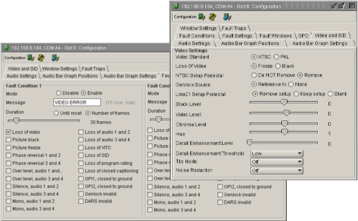
Using VistaLink PRO a user can change individual module setups by accessing and changing values in its associated Configuration View. Configuration Views provide access to all controllable parameters available on a module similar to its card edge controls or OSD menu system. Configurations can be saved and loaded into hardware using the VistaLink PRO system.
By taking advantage of VistaLink PRO's Advanced System Configurations feature many powerful and scalable system presets can be defined and used to quickly and accurately change hardware setups.
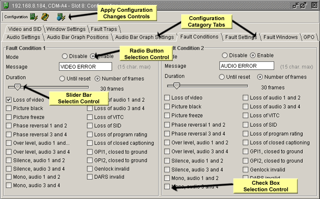
Each Configuration View window provides a means of remotely viewing and setting the various parameters within a product. The configuration view window is composed of a series of tabs along the top of the window and a content area for each tab that contains the various configuration options. The configuration options, also known as components, can be broken down into six basic categories.
Described below are the six basic component categories and how each component operates.
Monitored
Text Component - The text component is a descriptive label.
This type of component cannot be selected and does not represent a modifiable
option.
Group
Box Component - The group box component, as it's name implies, is
used to represent a group of common or related configuration options.
Radio
Button Component - Radio button components are used to represent a
choice in configuration options. A single radio button represents
each option. Only one radio button item can be selected within the
group of radio buttons present. To change the value of a radio button
component click on the radio button with the left mouse button.
Since at least one option must be selected within a group of radio buttons,
to remove the selection from one radio button you must select a different
radio button within that group.
Check
Box Component - The check box component is used to represent an ON
or OFF condition. If the component has a check mark to its left
then it is enabled (or ON). If there is no check mark beside the
component then the component is de-selected (or OFF). Check boxes
can only exist in one of the two described states. Check boxes differ
from that of Radio buttons since check boxes can be grouped together with
each check box being selected. To change the setting of a check
box component click on the component with the left mouse button or press
the space bar on the keyboard.
Slider
Component - The slider component is used to represent a range of possible
values. Slider components have a minimum value and a maximum value.
The current value of a slider is represented by the position of the thumb
box. To change the value of a slider component, click and hold the
left mouse button on the thumb box and drag the box either left or right.
When finished, release the left mouse button. You can also change
the value by pressing the left or right arrow keys on the keyboard.
Dropdown Component - The dropdown component is very similar to a group of radio button components. The dropdown component presents a list of options when expanded. Only one of the options in the list can be selected at one time. To expand the list of options, click on the down arrow. To select one of the items in the list, click on the item with the left mouse button. An alternative is to scroll to the item with the arrow keys and press the Enter key on the keyboard.
Below is a screenshot containing the various component types: